
The colours are black, white, red, green, blue, yellow, magenta, and cyan.
The point of this, is to make mosaic pictures look maximally realistic when
there are few colors to choose from. Here is a picture with the
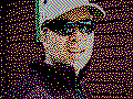
minimum amount of colours, just black, cyan, magenta, and yellow.
As you can see, the colours are a little off, compared to the picture above, and that is because there are just 4 colours to choose from, so it is not possible to mix to any colour, such as red. But still, the picture is recognizable and clear.
That this dithering is good can be seen by moving away from the pictures, so that the dots blur together, and the result is that the pictures look realistic, and sooner than for other realistic ditherings.
The use is of course not that interesting, since modern screens do indeed have lots of colours, but other stuff has not, such as printers and real mosaics. A friend of mine is working on a Lego mosaic dithered by me.
The reason I am working on it at all, is that it is a fascinatingly hard problem that I started on in 1981, when I got my first computer, a Sinclair ZX81 with just 80x48 pixels. The current program is quite slow, using hours to weeks to make the pictures, but can be sped up if necessary. The problem is NP-complete.
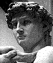
Wikipedia has a page
about dithering. I dithered their test picture:
It looks most like the Stucki dithering there, but if you see inside the top of the ear, my dithering keeps the details better. My dithering also creates more checkerboard patterns with single loose pixels, since this is better, and it handles colours better too.
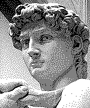
Here is the testpicture with gamma correction, so it has shades more equal
to the original.