


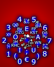
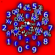
Here are some small free examples, suitable for cell phones:
|
|
|
|
|
|
 |
 |
 |
 |
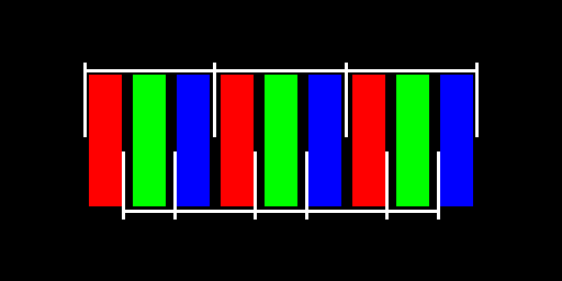
While my system orders the same colour strips into twice as many pixels, with the difference that every other pixel is purely green, and the remaining pixels are red-blue, as shown above in the bottom of the picture.
But the non obvious thing that makes this work so surprisingly well is that the light level, the valeur of green is about as strong as the red and blue combined together. This means that these SubLCD pixels are about equally bright when seen through a black & white camera. Text, which is black and white as well, becomes extremely sharp with SubLCD. Colour pictures are typically sharper as well, especially non coloured edges.
Use it like this:
./SubLCD < input_file_in_binary_raw.ppm > halved_output_file.ppm
It can be compiled like this:
gcc -o SubLCD SubLCD.c
The license is MIT, more free than BSD.
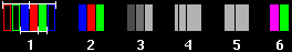
1. The highlighted subpixels are 2 SubLCD pixels, 3 subpixels.
2. The point was to have 3 fields of successively intenser colours. The red is typically twice as luminous as the blue, and green twice as red. The official luminosities for television are Blue: 11%, Red: 30%, Green: 59%, but I have measured blue to be 17% in practice, so it varies.
3. Black and white, greyscale representation of the colours. As you can see, they have different intensities.
4. Same intensities as 3, but represented as width of fields instead of intensity of the grey colour.
5. The intensities for blue and red are joined, giving an intensity almost as high as green.
6. As you can see, the red and blue combined give a purple pixel, which is about as luminous as the green.
Conclusion: Red and Green together have about the same luminosity as green, and if treated as 2 subpixels they will look like 2 subpixels. The 3 primary colour subpixels will NOT look like equal subpixels because they have different luminosities.
This means that there really is not much more than 2 pixels of information available in a subpixel system, even if it uses all the 3 segments individually.
If you want to write as small letters as possible, and want them to look good and be easy to read as well, I recommend using vertical line widths and spacings of at least 2 SubLCD pixels, and mostly a multiple of 2. I have tried font widths of 1 SubLCD pixel, and while they actually are readable, they are not pretty, have colour spatter, and are so small you must be nearsighted to read them.
Colour spatter happens surprisingly seldom in practice, and when it
happens, it is usually visually nice to look at. The spatter is
purple-green on black and white pictures.
If you really must avoid colour spatter, you can contact me, since
I know of ways of filtering that away. But I recommend living with it
since it very seldom is a significant problem.
As for other more complex methods, I experienced the following
problems and more:
The different light intensities of the red,
green, and blue segments make the edge of letters look a litte stair
cased when using 3 equal subpixels. Compensating for that made the
colours look weird, or the edges look strange. Combining 3 subpixels 3 ways
for each real pixel gave nice antialiased letters with no colour
spattering, but looked almost no better than ordinary
antialiasing. Combining 2 subpixels gave both colour sputtering and
lower resolution.
I can give more mathematical reasons for why SubLCD is good, but that requires more work, and I am done for now. I could elaborate this into a fully fledged scientific article, but I do not see sufficient advantage in that.
SubLCD makes half its pixels by aggregating 2 subpixels from
neighboring pixels. Or by aggregating blue and red
subpixels, but not the green.
The claims of the patent talk about using single
subpixels, which SubLCD do not.
I found no mentioning there of
aggregating subpixels, even though it looks like Cleartype
groups threes in practice, which again is very different from SubLCD.
I examined several more patents, but as far as I saw, all of them used the paradigm of separate subpixels, as opposed to the half aggregated multipixel subpixels of SubLCD.
As for prior art, there is the Apple II, which had a limited colour display system consisting of purple and green stripes, and it was some times used in a sub-pixel manner, very like SubLCD.
My competence at patents is lower than a professional patent engineer, but not zero since I have managed to patent on my own. This means that I might be saying wrong things about the patents, but that it is not overwhelmingly likely. And there might be patents I have not examined deeply enough.
I have a couple of patents, and even did one myself, which was granted in Norway and PCT and is ongoing, but still no money. My experience with patents in practice has also pushed me closer to be against patents. So, it is better that people get a way around sub pixel patents than I not publishing this.
2007-04-15
Added a link to the "absence" proof.
2006-08-31
Added section "Light levels"
2006-08-30
I put it on the net.